My team at Range recently decided it was time to seriously upgrade our Slack app. So I did what any good designer would do: I opened up the Slack API docs to build an understanding of the constraints. I wanted to know what interactions were supported in Slack, so that I could design workflows that our engineering team could actually build. That was the plan anyway.
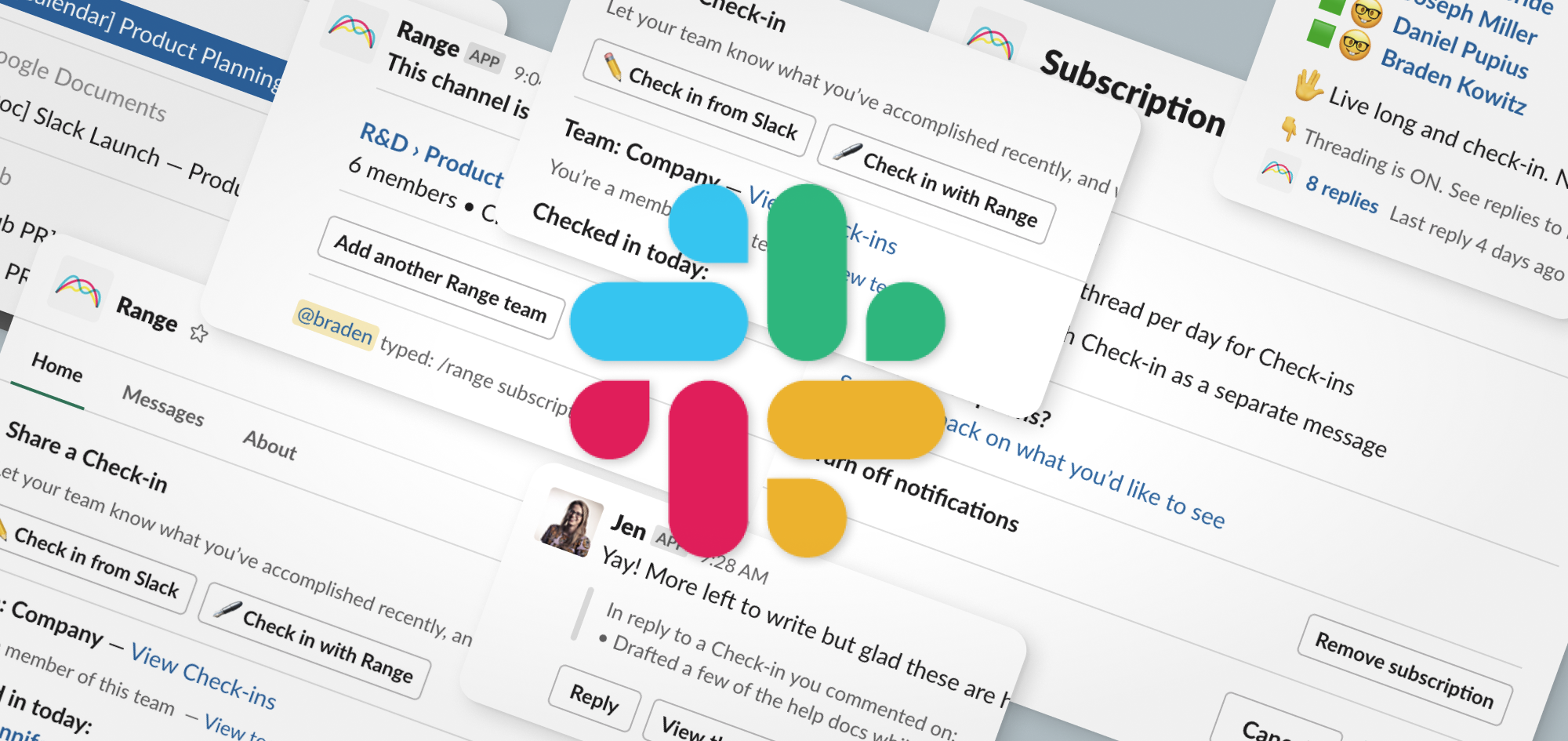
The top Slack integrations for Range & beyond.
As it turns out, even with all that studying, I still made a ton of mistakes about features I thought could be built, but didn’t work because of Slack API limitations. After designing all the features in our Slack app, I feel like I finally know what I’m doing, and have some wisdom to share.
If I were starting again from scratch, here’s a few tips I wish I would have known at the start:
Tip 1. Start with design constraints
The fastest way to learn what a Slack app can do (or not do) is to look at the “Scope and Permissions” documentation from Slack. This is counterintuitive since there’s a bunch of other getting started docs. But as a designer, this page shows you exactly what you’re allowed to do within Slack. So it’s a perfect constraint checklist that you can use to shape what workflows your app can support.
Tip 2. Tinker with Block Kit Builder
The visual and interactive elements you can display on the screen are defined by Block Kit. It’s a very limited set of widgets and formatting rules. The best way to get familiar is to read the docs, and then play with the Block Kit builder. When I first started designing Slack features, I spent about 50% of my time playing with the Block Kit builder, sending messages to Slack, and seeing exactly what the formatting looked like.
**Pro Tip: **The Block Kit Builder will melt your CPU. So find a power adapter before you start.
Tip 3. Consider how you’ll store state
The technical way that you generate interactivity within a Slack message (or Modal, or App home) is to have your backend respond to a user action, and then re-render that entire message.
This is very different from the way the web works today (and much closer to the way the web used to work). A web browser can now remember all sorts of state about the UI that’s being shown to a user. But with Slack, the state-management is much more limited, which means the backend often has to be more complicated.
The upshot is that you should talk with your developers about how you’re going to store UI state.
**Watch out: **Not all messages can be interactive. When your app sends an ephemeral message (“Only visible to you”), that message can’t be rewritten, which means it can’t be interactive.
Tip 4. Your app can impersonate people
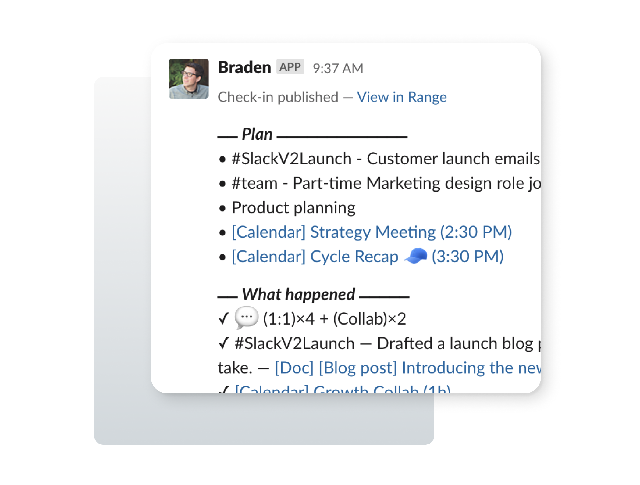
Your app can pretend to be another user in the workspace when it sends messages. Yeah, it’s kind of crazy, and it shouldn’t be misused. But it’s incredibly powerful because you can show content that someone has written using their own identity.
Tip: When using impersonation, put the content before the context. That is, lead with the exact text that the user has written before showing anything else. That way you’re clearly representing what the person said.
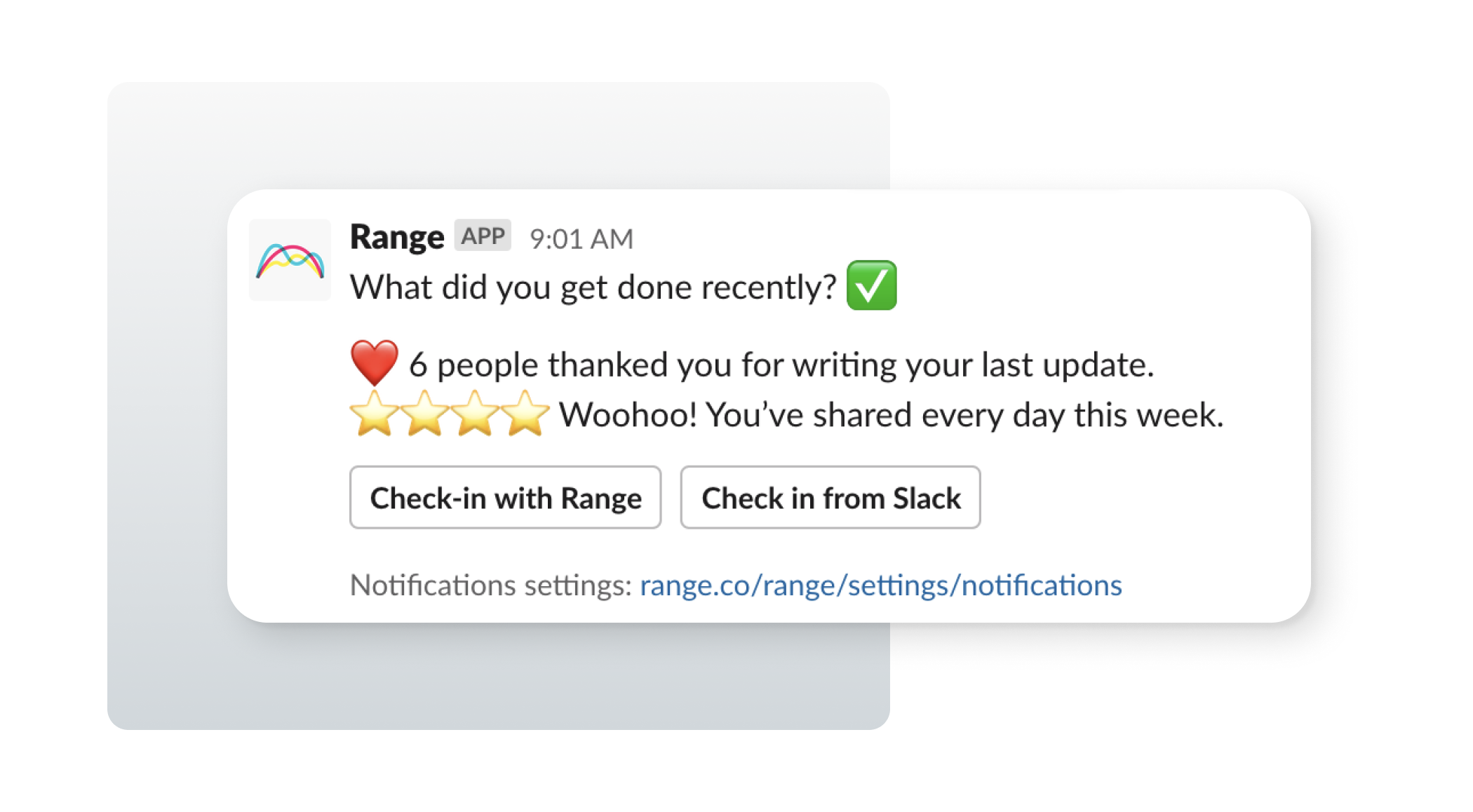
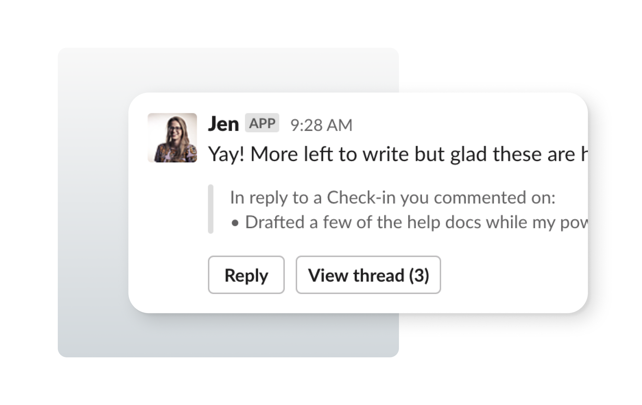
Tip 5. Use DMs sparingly, and promote notification settings.
We learned from early mistakes to use the Direct Message (DM) channel very sparingly. It can’t be muted like other team channels in Slack. That means whatever you send to customers via DMs will always show up for them as important in Slack. So it’s much better to send content-heavy messages to team channels.
My rule of thumb for DM-worthy messages is this: would some users want a push notification message about this? For Range, reminders to Check-in and comment notifications both reach this level of importance. So they work really well in DMs. We send almost every other message to team channels.
When you do send DMs, you should give users a very clear way to manage their notifications. Slack’s UI to manage apps can be a little confusing, and we had a few cases where users were trying to mute their individual notifications, but accidentally removed the entire app from the workspace instead. Just like email, make it easy to unsubscribe.
**Pattern: **Add a “Notification settings” context block as the last element in any DM to a user. It’ll appear as tiny text and you can link to a view in your app where they can manage which DMs get sent to them.
Tip 6. Give up on pixel-perfect message formatting
Longer or more complex messages are never going to look great in Slack. With Block Kit, there’s no concept of a “headline”, so it’s hard to group content. And vertical spacing between elements is a mess. Even with a lot of tinkering and hacking, I could never get longer messages to look great in Slack. So just relax and get things as close as possible.
There were a few tips we picked up through all the tinkering:
We found that using a markdown quote was a good way to indent text, especially in the small gray “Context” blocks. But when used too much, the spacing starts to look bad. So use them sparingly
> This is a markdown quote. It’ll show up indented with a gray left border.
We also found that using some creative unicode characters and markdown formatting allowed us to create section dividers between content elements that looked alright:
*⎼⎼⎼⎼⎼⎼ _Section Divider_ ⎼⎼⎼⎼⎼⎼*
We learned that you can’t use bulleted lists in your messages. Yep, users can send them. But your app can’t. I know, life isn’t fair. You’ll just have to use `•` characters instead.
• Fake a bulleted list
• Because it’s not yet supported for Slack apps.
When using Emojis, it looks way better to add two spaces before the text starts:
🏄  Kowabunga dude
🐙  Put 2 spaces after your emojis
I spent a lot of time testing message layouts in the Block Kit Builder, and sending the messages to myself for testing. Which reminds me…
Tip 7. Always test on mobile. Always.
If you’re getting even remotely clever with your message formatting, you should absolutely send the message to an Android and iPhone version of the Slack app. We saw unexpected results when using multiple newline characters, and when using emojis.
And when you test on mobile, you’ll realize that all of your messages need a plain-text fallback so that they display correctly on your phone’s lock screen. When you’re designing a message for a developer, it’s helpful to also include the fallback text if it wouldn’t be obvious.
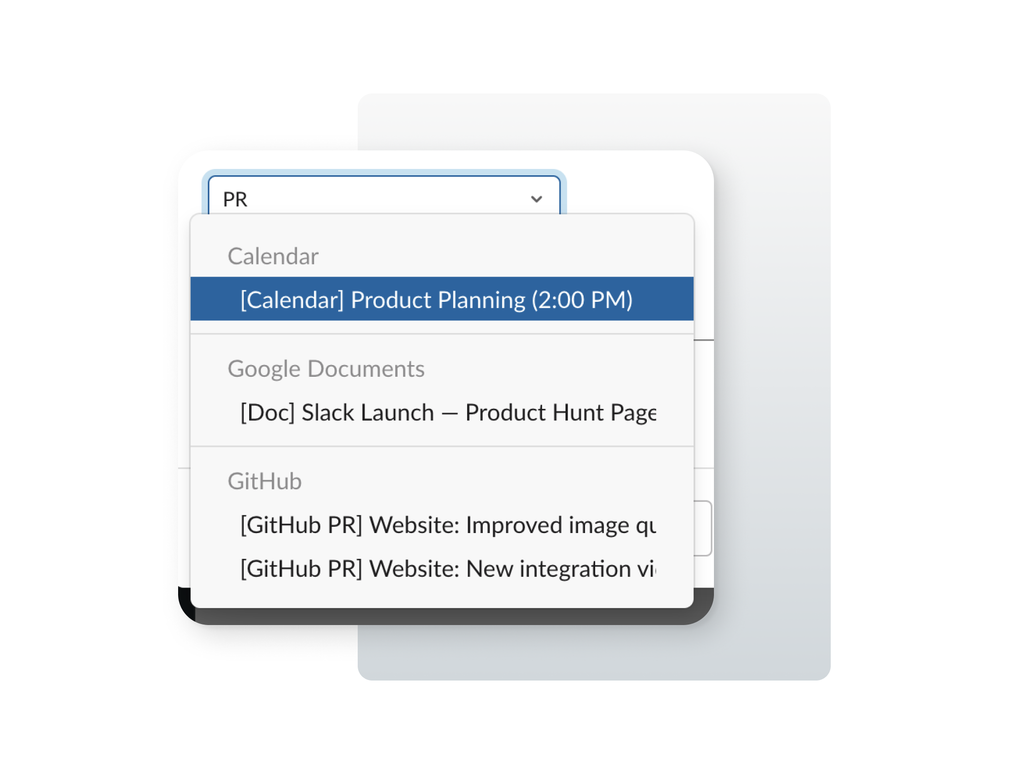
Tip 8. Select inputs are crazy powerful
The dropdown select elements in Slack are really great. You can group content within them, you can type-to-search, and you can populate them with server-side data. Slack even has versions that automatically include channels or users. All that’s to say: You can cram *a lot *of functionality into a little dropdown box.
We used the select input to let users attach work from their connected tools to a Check-in. It works way better than I expected. (Here’s a quick demo)
Tip 9. Don’t be afraid to get creative
A lot of working with the Slack API is wondering, “Hmm, can we do that?” and then playing with the API to figure out what happens. Here’s just a few examples:
While designing our subscription management modal, I wondered…
What happens when a delete action within a modal triggers a confirmation modal? Would it work? A modal within a modal? Inception?
I really didn’t think it would work, but we tried it, and it worked great. Other times I designed simple flows that just didn’t work, and we had to scratch the whole design and start over. That’s just how it goes.
Tip 10. Embrace experimentation
The best way to design for a quirky and restrictive UI surface area is just to experiment a lot. Set this expectation with your team, and then let yourself have a little fun!

I hope this article was helpful to you. Please let me know if you have any questions. You can find me on Twitter @kowitz. Want to say thanks? Share this article with another designer who might find it useful, or try out our Range Slack app with your team. Thanks!